logo.png
 

Fitsust is a fitness application that enables users to maintain a flexible fitness lifestyle by providing structure, guidance, and accountability.


My role - UI / UX / Visual Design

Overview


Problem space

People struggle to maintain a sustainable fitness lifestyle despite numerous applications, coaches, and plans due to this, many people return to an unhealthy lifestyle.

“Only 48% of Americans say they meet the federal recommendation for exercising half an hour most days of the week, and the actual percentage is believed to be much lower.”

  • Stanford university

Constraints

  • 3 months of total time

  • One person team

  • Global pandemic due to which in-person tests were not feasible

  • Remote testing and interviews

  • Extremely low budget for primary research and guerilla testing

Solution

A mobile application that allows the user to get structured yet flexible workout/ nutrition plans and allows them to quickly track and share them with other people in order to maintain accountability and stick to their plans


The Process

theprocess.png

I researched how some people are able to maintain an active healthy lifestyle while others fail to do so

 
  • To understand our user’s lives,  attitudes, perceptions, and behaviors, I conducted one on one user research interviews with the members of a Slack community who live an active healthy lifestyle as well as people who have done so in the past.

    The interviewees were recruited through a Google screener survey which helped to narrow down the potential user base. From the screener, I interviewed five people who had a fairly active lifestyle. These people worked out frequently or did so in the past. In order to understand how someone sustained their active lifestyle and what made other people quit, it was crucial to include both types of people as interviewees.

Interviewees

Fitness background

Notable Quotes

Bruno P

Used to workout frequently in the past

“I focused on nutrition since I was trying to gain weight ”

Sun C

Started a weight loss journey

“If I cannot follow it for the rest of my life I am not gonna do it at all”

Geldmyer M

Works out regularly

“I like having somebody telling me what to do”

Mohanty A

Does light cardio and goes on for runs frequently

“I was looking for proper technique”

Goodman JT

Goes to the gym and lifts heavyweights

“It feels really good to see the people that I care about hitting their goals”


Topics regarding habit formation, fitness, and sustainability helped me better understand the problem space


Secondary Research - Articles/Books/Journals

Sources

Insights

Atomic Habits - James Clear (Book)

Shifting focus from outcomes to process by setting process goals, setting short-term objectives, and keeping a workout journal.

create-sustainable-fitness-habit

Using habit trackers and other visual forms of measurement can make your habits more satisfying by providing clear evidence of your progress

how-to-make-exercise-sustainable

adopting the mentality of “reducing the scope, but sticking to the schedule.” The basic idea is that on any given day it is more important to stick to your schedule than it is to meet your expectations

The Power of a Gentle Nudge - Kevin Helliker

(The wall street Journal)

Using an accountability partner that can create an immediate cost to inaction.


Most products that are trying to solve similar problems are overwhelming the users with premium content, increasing the cognitive load, and thus making fitness convoluted


Competitive Analysis

In order to know what other applications are doing in a similar problem space, I performed a competitive analysis. With Neilsen’s Heuristics in mind, I evaluated the applications that were addressing similar user needs. There were a lot of similarities and differences amongst the applications, so I decided to separate the unique pros and cons that stood out the most. These insights helped me a lot while designing the functional needs of Fitsust as they showed me what might work best for my user base and their problems.

Application

Pros

Cons

Adidas training

A good amount of user control allows the user to customize workouts

A lot of premium ads between the elements on the screen

Nike training

Tutorials with high production value 

Overwhelming amount of options that might trigger choice bias

Fitbod

Wide varieties of exercises and goal setting

No help for the nutritional aspect of training

Aaptive

Extremely modern and intuitive UI

Limited free features 


EMPATHY.jpg

Empathy map

Based on my primary research, I created an empathy map to understand what users might see, hear, think, and feel. For our user base, I focused on what they say and do when they are working out, asking for advice, and searching for nutrition plans.

 
persona1-01.jpg

Persona - The Fitsust User

In order to design for the Fitsust user base, I created a persona. Ethan is a 23-year-old male who works out at home. In every design decision onward, I took Ethan’s attributes, concerns, and goals into consideration.


    • Flexibility is a major concern for a lot of the users both in their routines and their diet

    • A lot of users search for structure and proper guidance in order to keep excelling in their respective fitness activities

    • Accountability and a sense of community plays a huge role in making sure the users are sticking to their routines

    • A sense of achievement provides users with the major motivation to keep pursuing their routines

  • How might we create a sense of achievement for the users?

  • How might we provide accountability for the users?


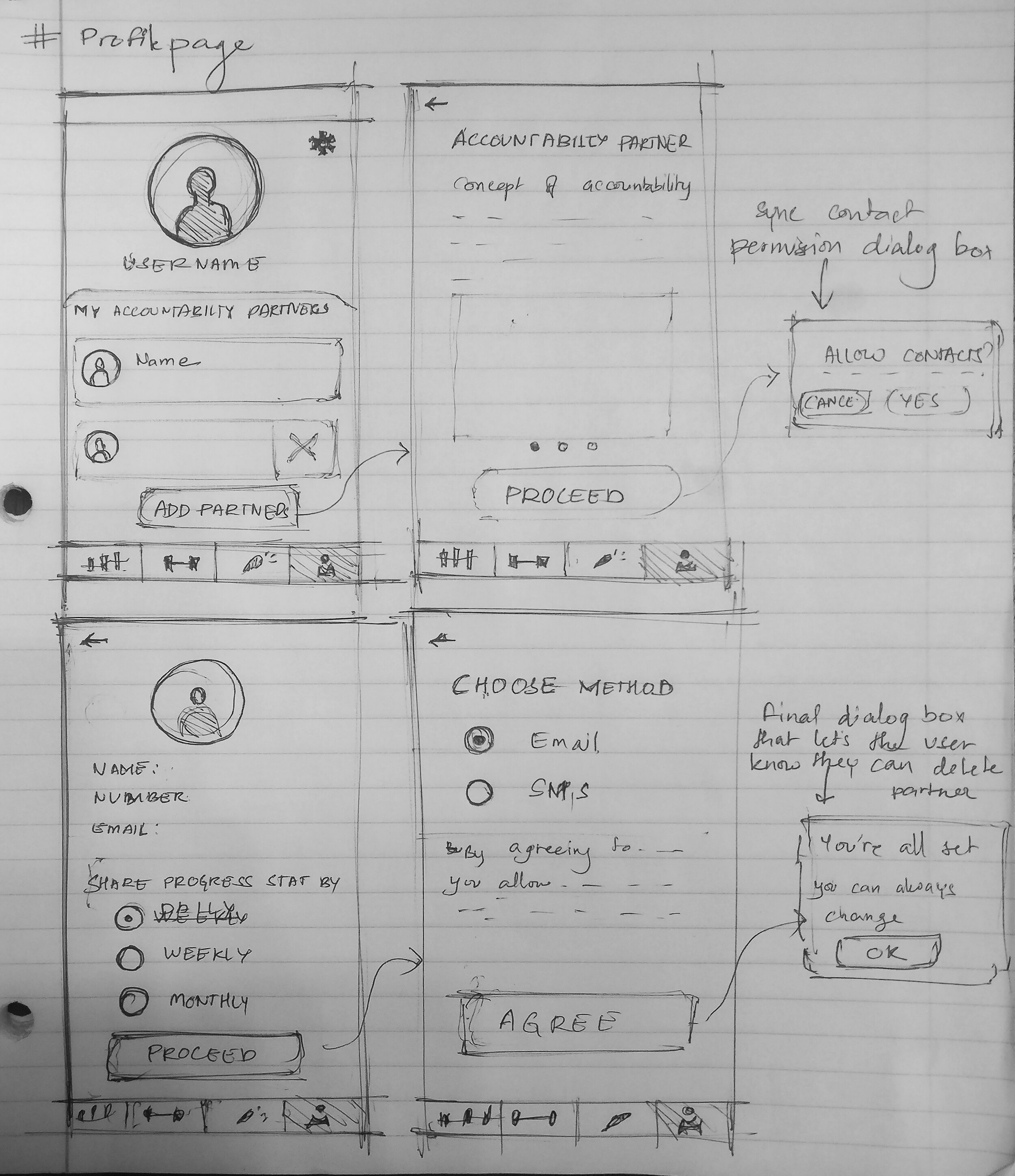
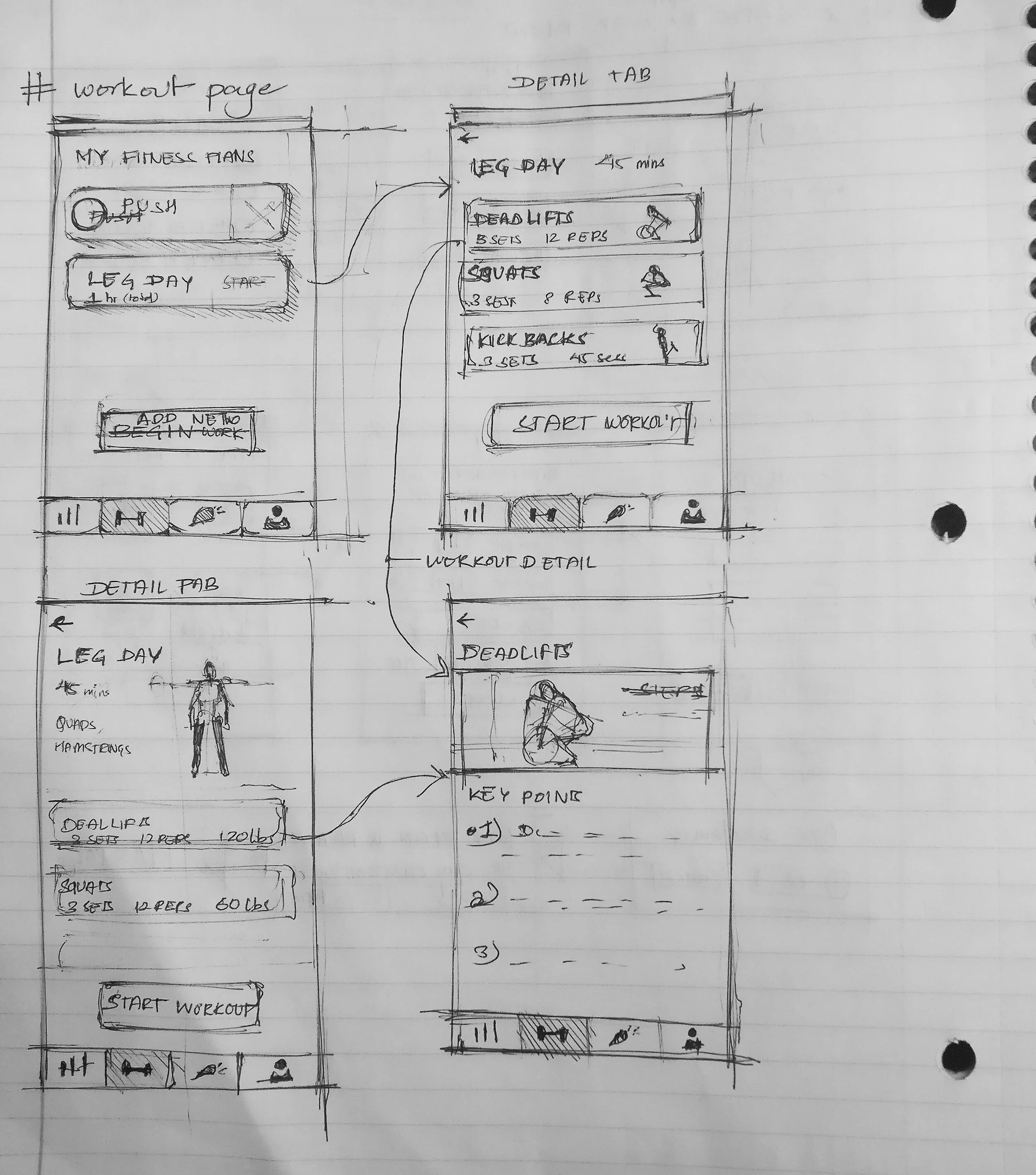
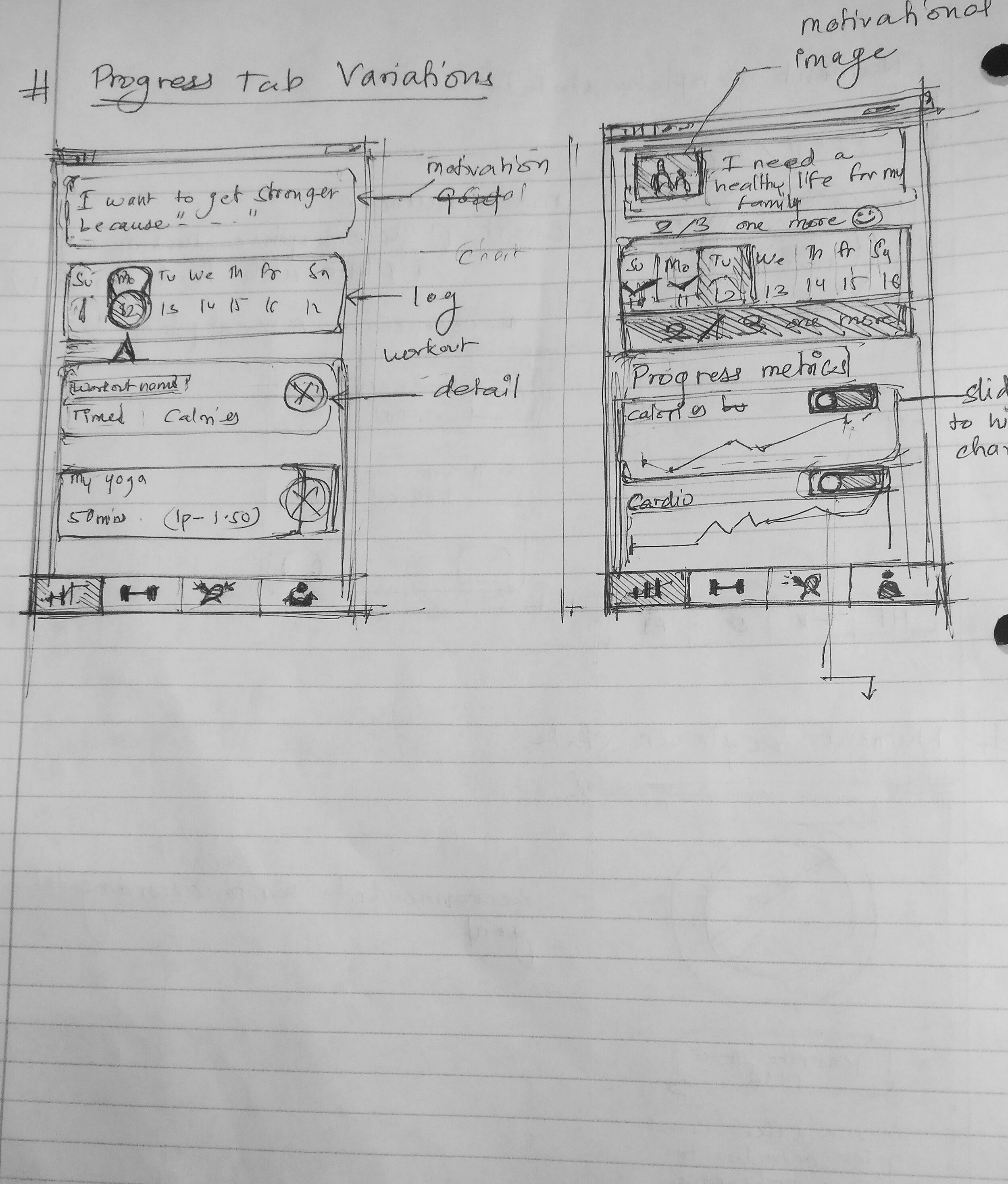
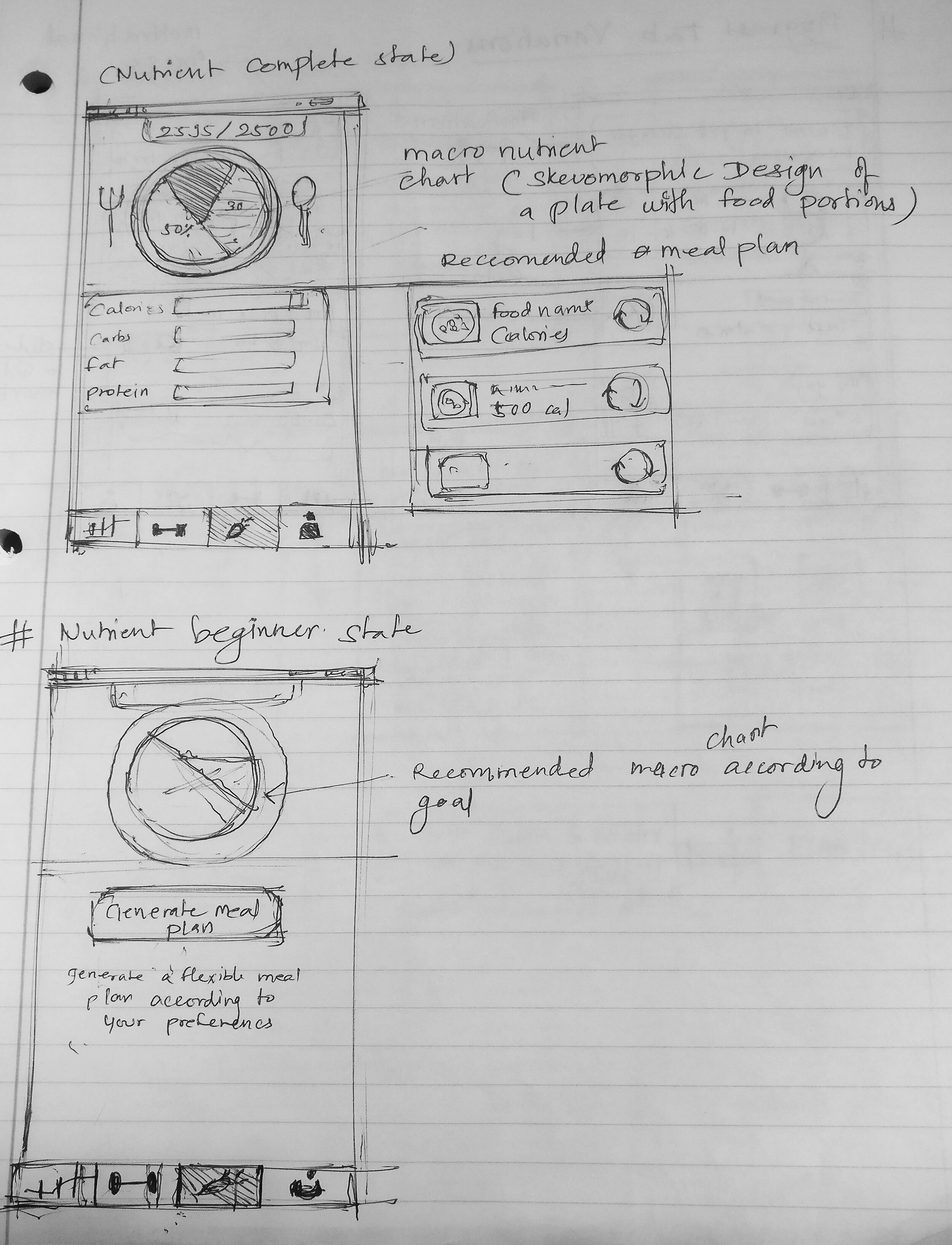
Ideation Sketching

Getting my ideas on paper helped me to refine the elements of the red routes. During ideation, I designed the solutions with regard to common libraries that are used by developers. For example, in order to visualize the macronutrients, I designed the chart in regards to a popular pie chart library called MPandroid chart.

I prioritized the features that would use as less technical and financial resources as possible, but still accomplish the main goal of providing a smart fitness lifestyle

userstories.png

In order to know the functional needs of the product, I  mapped out the user stories that helped me prioritize what would be included in the minimum viable product (MVP). Using the insights gained after the research stage, I created a user story map to tackle the user needs and pain points.

Viable is not equal to valuable” - Michael Seibel

Keeping this quote in mind, I prioritized the most valuable features that would solve Ethan’s problems.


The Information architecture was designed to show the user their progress first which would then lead them to workout.

finalsitemap.png

In order to reach the core functionality in one tap, I implemented a bottom tab (footer) navigation. It was crucial to make sure that the site map was designed to fit less than 5 tabs. 
In the first version, the site map was designed to include the profile in a tab called ”Accountability,” but after the user testing this turned out to be confusing to the users as it turned out to be too vague. Based on this feedback, I redesigned the site map to make sure that each tab would be distinct and functionally clear to the user.

Guerilla Usability Testing

After I created the rough sketches, I created a paper prototype to user test the sketched screens and user flows and have a more solid foundation to create the wireframes. All of the screens were sketched digitally, and I used Marvel to create the low fidelity clickable prototype


The main accountability system was a bit difficult to understand, as the users could not figure out how their progress was going to be shared.


Since most users didn’t want the application to connect with their friends through email. The next iteration allowed users to view their progress log in order to establish accountability partners.


I tested a high fidelity prototype with people who are physically active


Participants

Fitness Background

Do C

Yoga instructor

Rodriguez N

Marathon runner

Windt E

Works out at home

Calderon M

Physical education teacher

L

Works out at the gym

 
    • Initial impressions of the onboarding screens

    • Uncover usability problems in the workout tracking process red route

    • Initial impressions of adding workout flow 

    • Initial impressions of the nutrient tabs

 
invi.png
proto.png
 

Findings

Issues

Summary

Recommendations

The users wanted to something more to be able to connect with their accountability partners 

After the users found the accountability partners, they would also look to connect with the partners in some way. 

  • some sort of chatting feature or a notification that someone has seen their log

Users could not find a way to delete the workouts from the plan

The users would go into the workout detail to look for an icon to delete the individual workout instead of the implemented pattern of sliding to reveal a delete button.

  • A simple guide or walkthrough of how to edit the individual workouts
  • Provide multiple options to delete the workouts


During the final usability testing session, the new high five notifyier felt more accountable to the users


After the first prototype testing was done, I had to iterate on the accountability flow to make sure the user felt more connected and accountable to their friends. To address this feedback, I designed a high five feature that allowed the user to high-five their partner’s log. It acted as a like button but focused more towards emotions of accountability instead of just validation. During the session the users clearly understood the high five features on their progress screen as well as the button on their partner’s log.

 
high2.png
high1.png
Progress_tab 1.png
 
FITSUST moodboard.png

With minimalism in mind, the branding was done with a clear goal in mind to make the visuals as less overwhelming as possible. I researched and looked for products both physical and digital that focused on minimalism as inspiration. By minimizing what is not important I wanted the user’s attention focused and their interaction cognitively less stressful.


Reflection

This project was very special to me, however, I knew not to attach myself to my designs and was always ready to iterate on my darlings in order to better usability based on new insights.

If I had more time, I would have spent it in the paper prototyping stage to further test out the iterations before moving on to higher fidelity. Doing that would have saved me a lot of time and I would have been able to use that time to further refine the prototype.

I would also consider motion and animation as early on as possible and not as separate entities. Incorporating motion in the earlier stages would have allowed me to ideate more intuitive and unique experiences for the user.

Previous
Previous

Upped Events - Web application

Next
Next

Huddlee - Cross platform mobile application